Despite an aggressive, ‘always-on’ approach to culture, Doritos faced a stark reality every October: the brand was nowhere near top-of-mind. Halloween is a season traditionally dominated by a ‘sugar monopoly’ where confectionery is the default choice and savory snacks are an afterthought.
Our Trick? Doritos Hijack Halloween!
In a season cluttered with noisy, complex advertising, we chose the path of radical simplicity. Our strategy was a ‘zero copy’ commitment. We didn't need headlines to tell our story; we trusted the power of the brand's most distinctive asset - the iconic triangular cornchip. The idea was to prove that not all Halloween treats need to be sweets, using the product itself to act as the ultimate visual lexicon for the holiday.
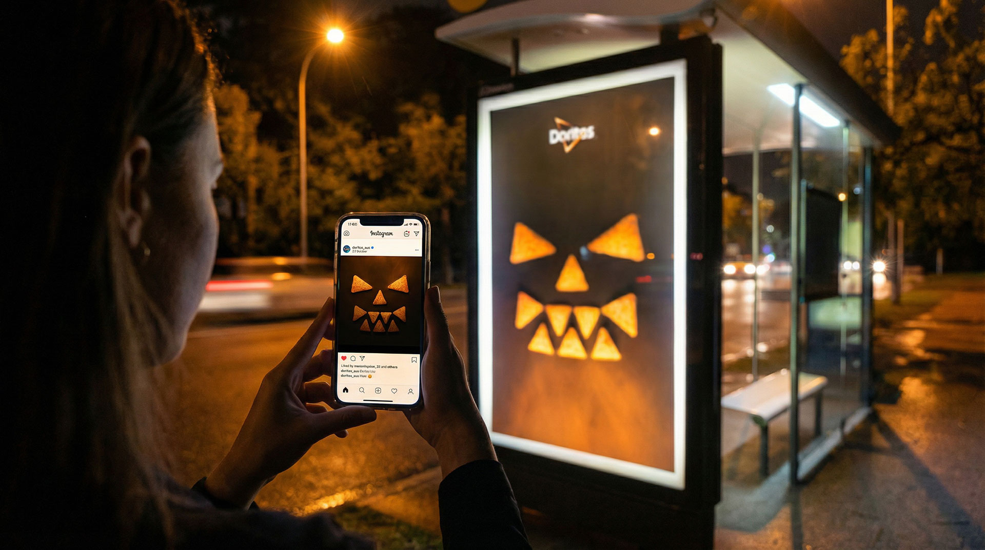
So, on the night before Halloween, Doritos dropped a scary-good-thumb-stopping campaign across social channels in a bold Halloween takeover - before spilling-out into the real world with an OOH media hijack-o-lantern…and it worked a treat!
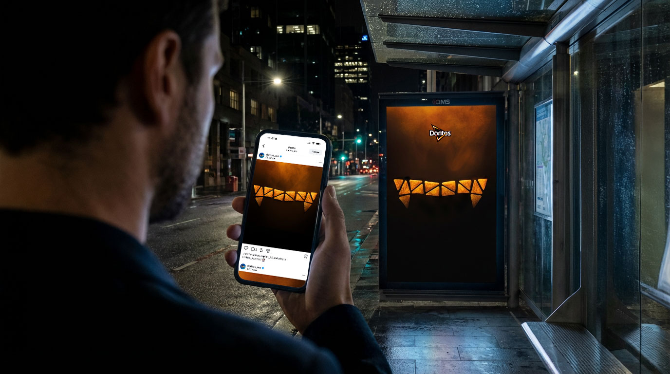

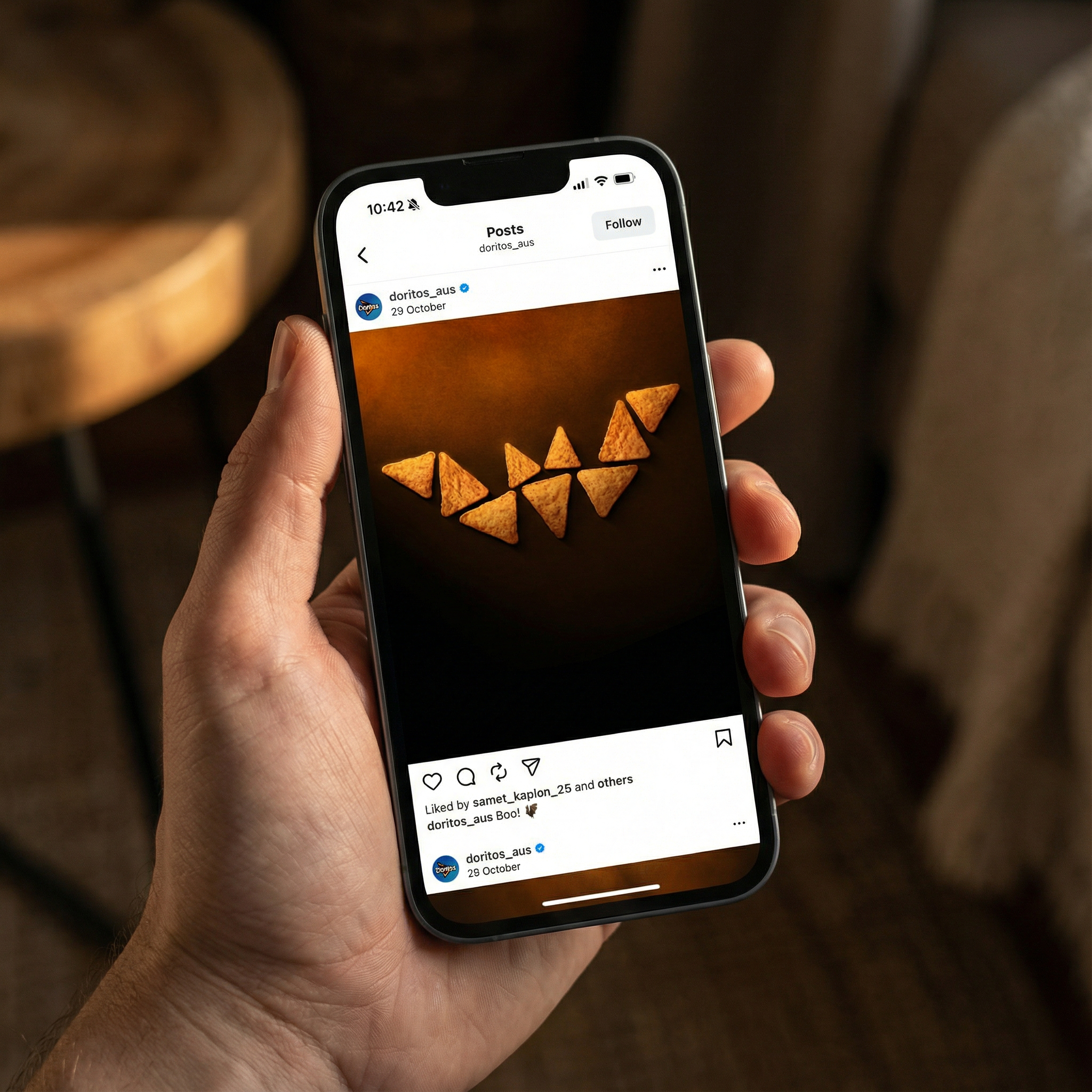
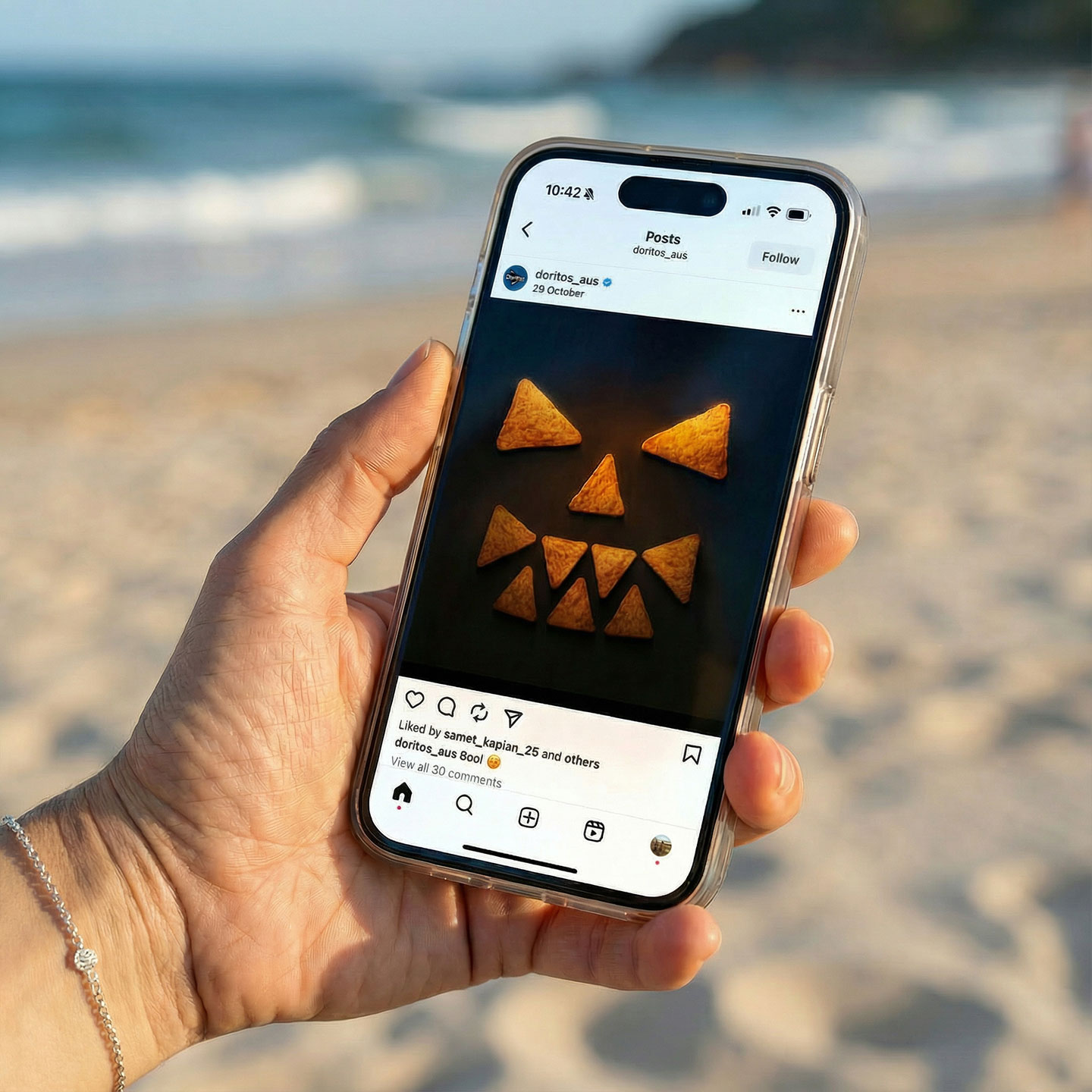
We stripped away all logos, taglines, and copy to create a self-referential visual language where the product literally became the art. Through meticulous arrangement, we used the chips to construct three instantly identifiable Halloween symbols:
Set against a deep, dark background, we utilized the rich orange texture of the chips to create a ‘glow’ effect. This transformed the iconic Doritos cheese dust into the campaign's internal light source, creating a visceral link between the product and the spooky atmosphere of Halloween.
-2025-12-18%20at%2010.33.08.png)
By embracing exceptional Art Direction and distinct simplicity, the ‘Halloween Hijack’ cut through the seasonal noise. It was a striking, confident visual statement that leveraged core brand assets to own a cultural moment without needing a single word. The campaign successfully positioned Doritos as the ultimate treat for the bold, proving that a strong visual identity speaks louder than copy.